The ups and downs of consistent icon design
Dec 11, 2022
Tags: ux, design, apple, mac, icons
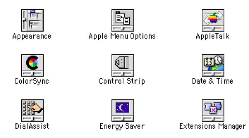
Consistency is often seen as key in UX design, and for all the enhancements we've made in visual fidelity, I personally don't feel that this is something we're excelling at. I was reminded of this when I came across the icons for Mac OS 9 control panel items in the file system (though if memory serves, this style of icon was introduced in System 7):
A quick look at at archive.org shows that this icon style was used for the first version of the System Preferences under Mac OS X, but the individual icons now had shed the consistent trimming - though given this was in a dedicated app now, that's understandable.
It's a common trope to complain that modern icons are generally unrelated to their function, and it's hard to blame the developers who are trying to distinguish their products in what is now a much more crowded marketplace than it was in 1990, but something needs (IMHO) to give. Perhaps then it'd be useful to decouple corporate branding from functional iconography?
As a specific case in point, at some point I have genuinely lost the ability to tell at a glance when trying to do tasks on my Mac or iPad which of these two icons is Slack and which is Apple's Photos:
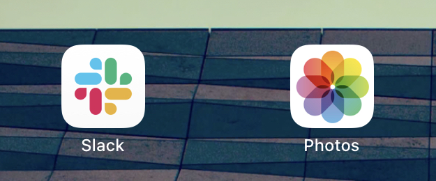
Neither of these icons relates particularly to any particular task I have to achieve, so when hunting the sea of icons that is the iPad launchpad when I have to either message a workmate or send a photo to my partner, I'm not surprised I have a poor hit rate of selecting the right thing first time. This is a real UX problem that seems to be mostly ignored by both the app designers and the platform vendors, and something I find frustrating on a regular basis.
Now, I will put my hands up and say I have shipped apps where, for example, the icon was a bright orange hexagon with the letters "Br" on it, but at least that was distinctive enough that I could describe it to someone over the phone, unlike say either of the above two icons.
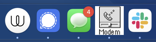
This point that consistency would be better is of course somewhat ruined by the mess that is instant messaging apps on my Mac's dock:
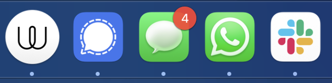
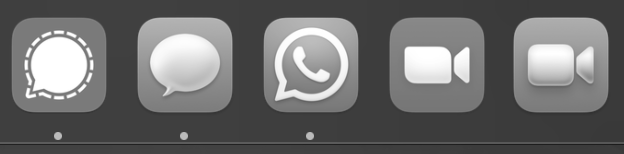
Leaving aside the fact that I have to run half a dozen chat apps to just get everyone in, the fact that Messages, What's App, and Signal all use close to the same iconography, and two use the same colour, is quite tedious. Often when I get the single dock icon bounce to tell me I have a new message I have no hope knowing which one it was and just have to cycle through all of them to figure it out. Zoom and Quicktime do the same thing, but thankfully I don't tend to leave them on my Dock in day to day work:
Now imagine trying to do all this if you have any visual accessibility issues, for instance running the system provided colour filter mode:
I slipped the Adobe Photoshop icon into one of the above pictures deliberately: I will admit that I have felt the Adobe suit icons are a bit dull at times, but credit to them, they are very functional: they both have a brand consistency, and yet I can pick each app out on my Dock, and never mistake one for the other, so functionality wise they're great - for me at least. If I had say dyslexia, or was just otherwise less given to recognising specific letters over say colour or shape would they work less well? Perhaps whereas some apps will let you theme the icon for different colours (like the text editor Nova, which I'm using to write this), perhaps we want to be able to have suites of icons that optimise for different recognition biases, as it seems wrong to assume we're all the same on that front.
To bring it full circle though, I was pleased to find the hacky workaround solution to this problem on a Mac is that I can still do the same trick I could do back on System 7 to replace an icon for an app - you can just find the app in Finder, go to File -> Get Info, and then you can select the icon in the top left of the window that pops up. It'll not only let you copy the icon, but you can past a new one in there too. It'll also still let you use a random bitmap for it - so a quick paste and then quit and reload of the app in question:
Perhaps not the most consistent choice of icon (it was the first bitmap I had to hand), but at least I can now tell What's App apart from Messages on my dock :) A somewhat glib solution to the problem, but if you're reading this and work on app design, please think of your app's icon in a sea of other apps and help us poor users go about our business rather than see it as a place to show off your company's brand.