Weeknotes: 7th September 2026
Last week
Local developments
This week I attempted to make a more nuanced version of my habitat map than I have done to date, and I'm glad I did, as it turned up some hidden problems with my data-processing that were obscured in the previous simpler versions. And better yet, both problems were evident a few minutes walk from my front door (possibly even visible from my office window if I leaned out in a way that wouldn't be approved by health and safety officials at the University).
Before we get into details, some context. Until now, I've been generating my new habitat maps using broad habitat categories, referred to as "level 1" categories from the IUCN Habitat Classification Scheme. At level 1 you are just deciding if each pixel in the map is "forest" or "shrubland" or "wetland" and so forth. In total there's 18 level 1 categories. Each category is then broken down into more detail, the "level 2" categories, so you get "tropical forest dry", "tropical forest moist", "boreal forest", etc. I'd thus far avoided working at level 2, partly because the applications that this map will be used for have thus far worked at level 1, and partly because I wasn't confident that I'd have enough data in certain parts of the world to give me the necessary level of detail. I've discussed in the last couple of weeknotes the struggle I've been having with generating my map for the Brazilian states of Minas Gerais and Espírito Santo due to low occurrence counts in GBIF and lack of detail in Open Street Map (OSM) zoning.
Operating at level 1 is defensible, however, it'd be much more interesting to operate at level 2. Whilst the main inspirations for my own work comes from the Lumbierres et al 2019 paper which worked at level 1, the other habitat map paper that is of comparable note is the Jung et al 2020 paper which is generated at level 2, although is perhaps the more simplistic modelwise.
Anyway, for fun I decided to try process the UK, where I know we have high levels of species occurrence data and OSM coverage, at level 2 and see what happened. At first glance, the map looked great: you could still see the same overall trends as the level 1 map, just now where we had "forest" before we had mostly "forest temperate", what was "shrubland" was mostly "shrubland temperate" and so forth.
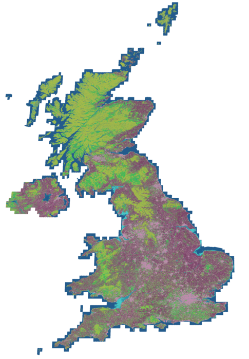
But all was not quite what I expected, and so I dug in and was amused to discover that the problems were ones that were observable from where I live.
The Great Cormorant and its subtropical forests
The first oddity I noted in the new map was there was a small but non-zero amount of subtropical moist forest in the UK. Now, I know from discussions between my colleagues Vinicius Tonetti and Aneesh Naik that there is some small patches of rainforest in the UK, and indeed Aneesh had tried using Tessera to map them, so I wondered if perhaps that's what was showing up. But when I plotted the locations of the pixels, it was clear that this wasn't what I found, I had a more general misclassification problem:
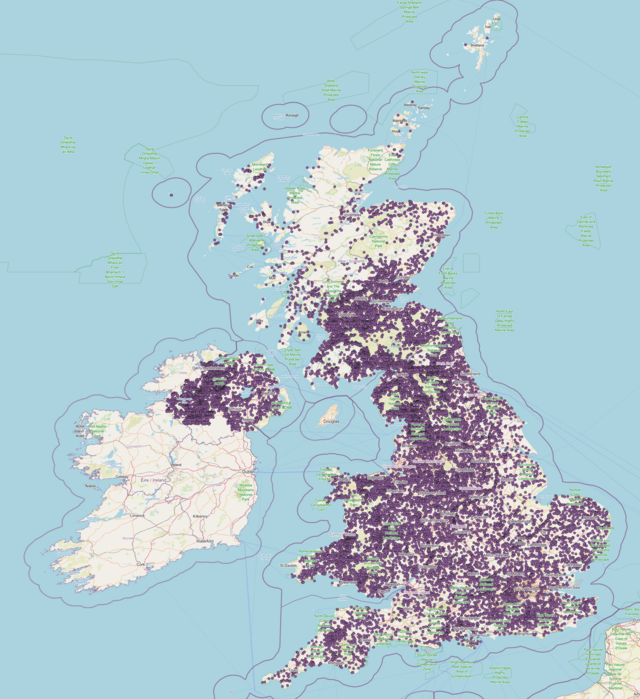
The root cause turned out to be a slightly silly gotcha of my own doing. I looked at which species in the UK would be seeding my map generation with subtropical moist forests, and it turns out that this was the main culprit, as taken on walk around West Kirby Marine Lake, not five minutes from my desk, a couple of months ago:
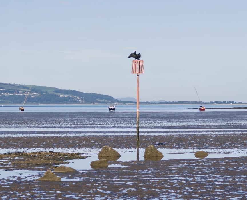
This is the Great Cormorant, a common bird around UK coastlines, and one we often see when out for a walk along the coast. If we look at the habitat preferences of the species as per the IUCN Red List data, we can see that it mostly likes different types of wetland and marine habitats, which aligns with what I see when I go for a walk. But we also see it likes a single type of forest: subtropical moist forest. Now, as a computer scientist I'm not an expert on this, but I'm fairly sure that's not what it's finding in the UK.
If we look at the range map for the Great Cormorant, that is to say the areas on the planet where a given species might exist according to the experts, we can see it's divided up into several different colours:
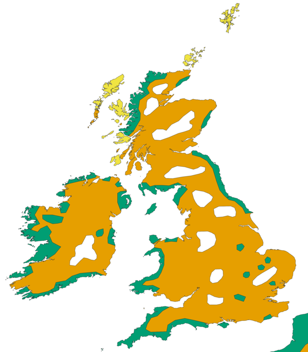
Each colour is what's called a "season": green, found along the coast, is resident (always present), the orange inland is non-breeding, and then the yellow up on the northern Scottish islands is breeding. You can kinda of think of resident as being an area where the species is present in both breeding and non-breeding seasons. This reflects the bird is migratory somewhat.
Similarly, if we look at the habitat preferences of the Great Cormorant from the IUCN Red List, we can see that its preferences are also tied to season. And in particular, its preference for subtropical moist forests is only in the breeding season.
The bug in my code was that when fetching species data from the IUCN Red List I was merging all the different seasons into one single range map and one habitat preference list, whereas the data is more subtle than that: certain habitats are only preferred in certain seasons. When I started this project I just copied my existing species data-fetching script from one of the application pipelines, where this subtlety wasn't important, but here it very much is. In my habitat map generation code we were seeing Great Cormorants in the UK in inland areas OSM marks as forest, and so we were noting that this area must be a forest the species likes, so adding all these occurrences of subtropical moist forest. However, if I actually treat the seasonality properly, then we know that the inland range of the Great Cormorant is only for its non-breeding season and it's not interested in forests then.
Now, I think that in general it's unlikely that the Hebrides have much in the way of subtropical moist forest either, despite the data supporting that technically. But in that case we have to rely on general statistics when we make the map removing those points, as we don't have other data to say it's not likely. I'll come on to this sort of filtering in the next bug.
The important thing to note here, other than the foibles of copying and pasting code from other projects, is that this was a problem in the level 1 map too, just it was hidden as we converted all the different types of forest down to the single "forest" label making it impossible to see. So the takeaway here is that even if the end of this project is a level 1 map, I should be working at level 2 as much as possible to highlight things like this.
The Marine Lake that wasn't
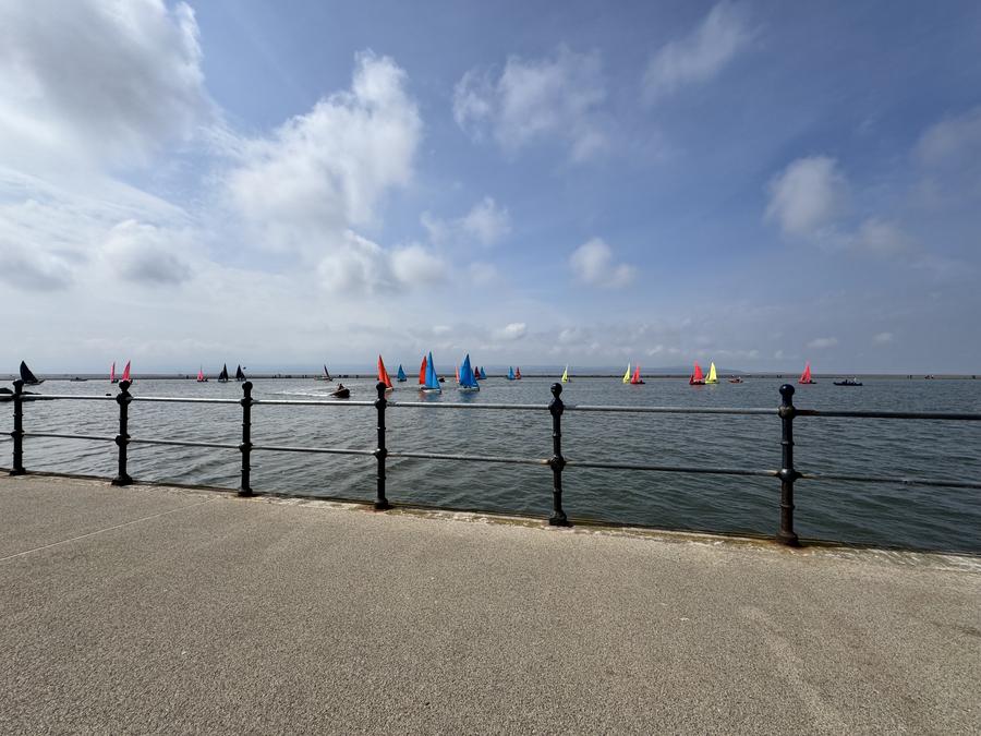
The other bug that showed up when looking into this one relates to where I was stood when I took the above photo. I was stood on the wall of the West Kirby Marine Lake, which is an artificial lake used for boating and (if you're so inclined) swimming:
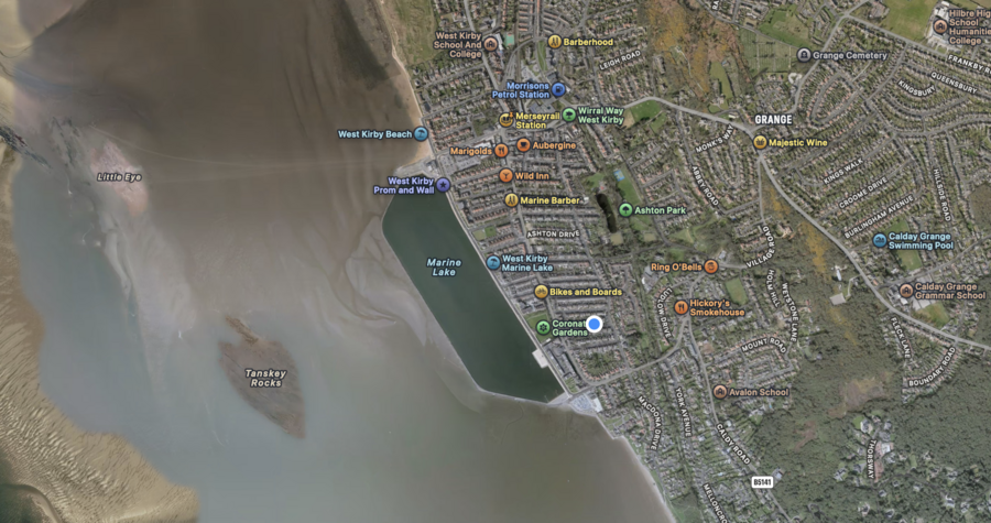
This is formed by an area of what I assume was beach that has been surrounded by a wall that is just below the highest tide level, which means it gets filled up with sea water periodically, and thus is a nice safe place for people to learn to sail etc.:
You can see the wall, which has a nice wide path on top of it for walking (it's about 2.5km around), in this photo of another bird we often see: the Little Egret:
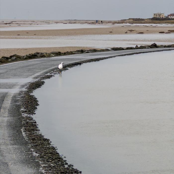
In particular, in that photo you can see the water level is almost overflowing, which indicates a recent high tide (or tide plus storm) was enough to top the lake up.
You may be wondering what the point is. Well, when I looked at my level 2 habitat map I couldn't help but notice that the marine lake clearly stood out:
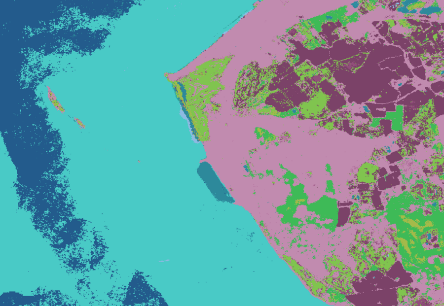
The dark blue to the edges is "Marine Neritic - Pelagic", which is basically the sea, then we the light blue as we come in land that is "Marine intertidal - mud shoreline", and you can see the intertidal zone in the above photo clearly enough. But the reason the West Kirby Marine Lake stands out is because it has been predicted as "Wetlands (inland) - Permanent freshwater lakes". There's several things wrong here, but the most important one for this discussion is the "freshwater" bit - I just spent ages telling you it's filled by the sea, so it is most assuredly not freshwater (though, as I've never been brave enough to swim in it, you might want to question my confidence here :).
So why do we make it freshwater? Well, it's because Open Street Map listed it as such. Until I corrected it, the West Kirby Marine Lake OSM entry was in OSM as natural=water, water=lake, salt=no. Thus when I use OSM data to refine the list of habitat preferences for species occurrences in the lake I've restricted them to freshwater wetlands, forcing those pixels to that level 1 category. It's basically poor hygiene on the input data.
Whilst I can fix this individual instance, it's similar to the issue I flagged last week in that just manual fixes like this don't scale. Ultimately it flags a broader problem I have which I don't deal with in my pipeline currently: incorrect input data. Both in terms of occurrences are perhaps mistagged as the wrong species, or the GPS coordinates are off slightly, or incorrect labels in OSM like this one. On the whole both GBIF and OSM are wonderful resources, but in any data set there will be some errors, and so the question is how to weed those out.
Thankfully, Tessera, the foundational machine learning model that I'm using to generate these maps, should be able to help here. If based on occurrences and OSM data I decide that a set of my training pixels are all "forest" say, but I think a few will be wrong due to occurrence data incorrectness or OSM filtering incorrectness, then I should be able to look at the statistical spread of the values in the Tessera embedding space, and spot outliers. That is to say, if for each pixel I look at the values in the 128 dimensions per pixel, I can see how well clustered the values are, and remove any that are outliers on the grounds that they are likely errors. This would need some testing to check I'm not throwing away good data, but in general I think this is probably the correct approach.
My colleagues Anil Madhavapeddy and Sadiq Jaffer have been doing some work around clustering in the embedding space using Uniform Manifold Approximation and Projection for Dimension Reduction, which seems to show clustering performance quite well, so I'll need to see if I can crib notes from their work.
Radical cartography
I picked up this book last year and finally got around to starting to read it:
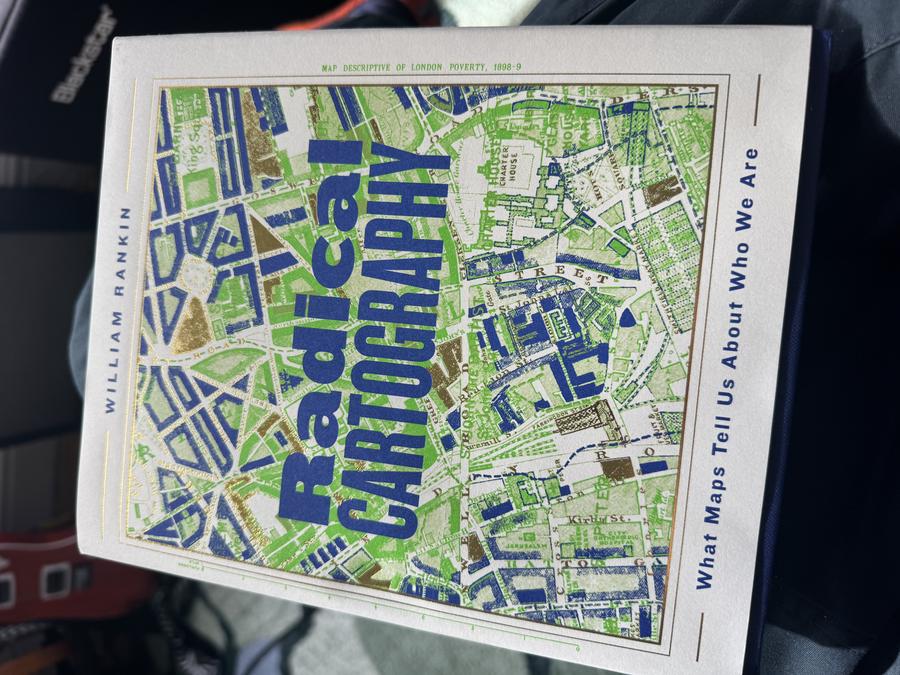
It feels particularly pertinent now that I'm building my own maps. As has been in the news this week with the UN moving to promote people to use the Equal Earth Projection, the lines we draw on maps are inherently political. In my line of work this is something I worry about a little, but probably not nearly enough. We make maps saying on some given metric where it is good or bad practice to do farming or logging or whatever, usually in the tropical countries where there is the most biodiversity to be impacted, but we do it from a place that is quite removed from that context. Historically it's generally been a bad thing when UK institutions try to dictate to the rest of the world how to run their affairs: that's a context in which our work needs to be considered. Hopefully the science we do is made open to question and scrutable so that people can pick it apart and see if what we claim holds up for themselves - this is one more reason that open science is so important. That hopefully enables it to be integrated with other information and insights we lack from not being of those places about which we attempt to derive results.
This is why, in the habitat map work, I've been keen to seek out experts who have on the ground experience who can comment on the maps I produce and how well they reflect the ground based on their knowledge rather than a mix of my assumptions and what I can encode in Python scripts.
I'm still early on in Radical Cartography, but already some of it has felt directly relevant:
"...These are conventions that render the world unnaturally solid and well ordered. Cartography therefore becomes radical when it embraces the inherent uncertainty, multiplicity, and subjectivity of both our data and the world itself."
This relates to the idea that the data is not certain, and thus the output isn't certain. We're starting to see in the habitat map domain the idea of probability or certainty coming in to what before were presented as absolute: this pixel is forest, that pixel is desert - there is no room in the TIFF format for ambiguity. But actually you can do this: when working on integrating farming data into the Jung et al habitat map last year our group decided that the best approach was to add it as a probability per pixel when converting what was in the original map, given we didn't know exactly where the better farming data should be (it being at 10km per pixel over our 1.8km per pixel map). Talking to James Ball and Aneesh about their work they're building confidence layers to go along side their habitat maps to try make it clear that we don't have perfect knowledge.
Anil has also pointed me at The Power of Projections: How Maps Reflect Global Politics and History by Arthur Jay Klinghoffer, so that's on the list next.
Claudius for the web
I did a little more on the web version of Claudius, and I think I've mostly got the API to where I like it, but I still need to get the bootstrap story sorted in my head, so I'm hoping to go over that with Patrick Ferris over virtual coffee this coming week.
Geoguessr
I instigated an initial work lunchtime Geoguesser. It was a small start (in the end due to time pressure it was just me and Sadiq), but we had fun, and as ever I learned a little from it.
Related to my earlier point: it's a tiny thing, but I've enjoyed using Geoguesser as a way to learn more about the world that I study from afar. For example, I've been studying Minas Gerais and Espírito Santo in Brazil, and I can explore them in Geoguesser, or at least the bits Google has visited. Whilst that is far from making me an on the ground expert, I find it useful to at least stop these areas from just being a set of abstract pixels on a top down map. When we do all this work the interesting places of the world are the parts with humans in it and they have their lives and pressures and it's just a tiny reminder that the work we do isn't just some abstract math problem, it's a reflection of human existence either in or indirectly impacting these areas.
Coincidentally it was the world championships this weekend, and the final match was really quite something.
This week
- I was meant to start on a LIFE update required for a paper submission by the LIFE team, but I failed to understand what it was that was being asked of me. I now have clarification, so hopefully I can get that moving so it's done before I vanish to Denmark in ten days time.
- I want to try tidy up my OSM categorisation code, which has been expanded on as ideas come, but I suspect could do with a bit of rationalisation. What I really want is a meta description that I can compile to both a diagram and be used in Python code to do the actual filtering of occurrence/habitat data, but I fear that is a yak I don't have time to shave (am actually grateful I don't have time for that).
- Get back to habitat mapping.
Useful/interesting links
- Whilst looking for a colour scheme that is colour-blind friendly for the range maps, I found the Okabe-Ito colour set.
- On the back of last week's chat about how to suggest edits for OSM, Adrian McEwan pointed me at MapComplete where I could publish topics that others can contribute to. He also pointed out there are quarterly project proposals in the OSM community, which could be another place to consider this.
Tags: weeknotes