Some notes on processing and display geospatial data
Apr 21, 2022
Tags: 4c, geospatial, geotiff
I'm currently part of the team over at the Cambridge Centre for Carbon Credits (4C), and it came up that we wanted a way to take some existing geospatial data on forest loss and present it in a interactive way on a web page. Whilst this isn’t my usual scene, I thought it’d be a good way to dip my toe into the kind of processing that my colleagues in the environmental sciences side of 4C do. This post is mostly a write up of what I learned for future reference, and might be of use to future computerists trying to start work with environmental datasets.
First things first: what is the data geospatial data being processed for this little exercise?
The data I’m starting with is the Global Forest Change (GFW) 2000-2020 data, commonly just referred to as “the Hansen data” after the first author as is tradition in academia. One aspect of this dataset is global data for forest loss over the years from 2000 to 2020, and it’s this subset of the full Hansen dataset we’ll be working on here.
At 4C we want to start visualising the output of various carbon-negative projects, both in what they achieved and the expected long term impact (for example, did a reforesting project have a positive impact long term, or did it just move the damage otherwhere, or did it just delay the deforesting, etc.). The first step to that is just to get a custom projection on the Hansen data visualised into a web page.
My warm up project thus was just to make a page that let me have a slider to show the impact of tree loss over time. Not rocket science (or indeed environmental or computer science), but a good chance to learn the data formats and tooling that is used in the domain.
If you’re interested in exploring the Hansen data yourself you can play with the data here.
The first learning was about how geospatial data is commonly stored, which much to my surprise is in TIFF image format.
In retrospect, perhaps I shouldn't have been surprised: TIFF is the go to lossless format when working with photography, and most earth measurements are just a two dimensional grid of values, so there is a natural fit there. To help with progressing the data, the TIFF files used have a set of custom header tags that give you some meta data about the geographical area being covered, such as the latitude/longitude of the corners, the coordinate projection system being used, etc. These files seem to be variously referred to as GeoTIFF or GTIFF format data.
Initially I started out assuming I’d have to write code to work with the image data directly, but it turns out that there's already a whole ecosystem of tools that I can use to manipulate those files. For this you want to use the GDAL (Geospatial Data Abstraction Library) set of command line tools and linkable code libraries, built to save you writing your own tooling for most common tasks.
For example, if you want to see all that extra metadata in a GeoTIFF file you can use the gdalinfo command:
$ gdalinfo Hansen_GFC-2020-v1.8_lossyear_50S_080W.tif
Driver: GTiff/GeoTIFF
Files: Hansen_GFC-2020-v1.8_lossyear_50S_080W.tif
Size is 40000, 40000
Coordinate System is:
GEOGCRS["WGS 84",
DATUM["World Geodetic System 1984",
ELLIPSOID["WGS 84",6378137,298.257223563,
LENGTHUNIT["metre",1]]],
PRIMEM["Greenwich",0,
ANGLEUNIT["degree",0.0174532925199433]],
CS[ellipsoidal,2],
AXIS["geodetic latitude (Lat)",north,
ORDER[1],
ANGLEUNIT["degree",0.0174532925199433]],
AXIS["geodetic longitude (Lon)",east,
ORDER[2],
ANGLEUNIT["degree",0.0174532925199433]],
ID["EPSG",4326]]
Data axis to CRS axis mapping: 2,1
Origin = ()
Pixel Size = ()
Metadata:
AREA_OR_POINT=Area
Image Structure Metadata:
COMPRESSION=LZW
INTERLEAVE=BAND
Corner Coordinates:
Upper Left () (' 0.00"W, 50d 0'"S)
Lower Left ( -80.0000000, -60.0000000) ( 80d 0' 0.00"' 0.00"S)
Upper Right ( -70.0000000, -50.0000000) ( 70d 0'"W, 50d 0' 0.00")
Lower Right () (' 0.00"W, 60d 0'"S)
Center ( -75.0000000, -55.0000000) ( 75d 0' 0.00"' 0.00"S)
Band 1 Block=40000x1 Type=Byte, ColorInterp=Gray
Description = Layer_1
Metadata:
LAYER_TYPE=athematic
It was a pleasant surprise that in the end I didn't need to write any custom GeoTIFF processing code: to start with I was able to use GDAL commands all the way for what I needed to do, even for transforming the data. In the end I did get to writing my own code to let me automate the process and do some optimisations of the workflow for performance reasons, but if you don’t have the time/knowledge/inclidation to write your own GDAL code, you can still get a long way just using the command line tools.
For the rest of this post I’ll mostly use the command line tool examples on how to process the data, as moving from those to the custom code versions is quite a lot easier than doing the inverse.
So, I have these geospatial TIFF files, but what do the images mean? Whilst some datasets are effectively big pictures taken with a special camera, some files, such as the ones I’m playing with here, contain more nuanced data: a common example would be the pixel value representing ground height for instance.
In the forest loss data that I was looking, there is a single 8 bit value per pixel (so a greyscale image), with each pixel having a 0 value for no tree loss measured since the year 2000, or a value 1 to 20 for the first year loss occurred since. This is described on the GFW page from which I got the data, and each file is different, so you basically need to do you homework here for the dataset you're working with and understand what each the pixel values mean.
Because these files are TIFF files though, we can validate our understanding of the data quickly using an image tool, such as Photoshop. Here is the forest loss data for the northern end of South America:
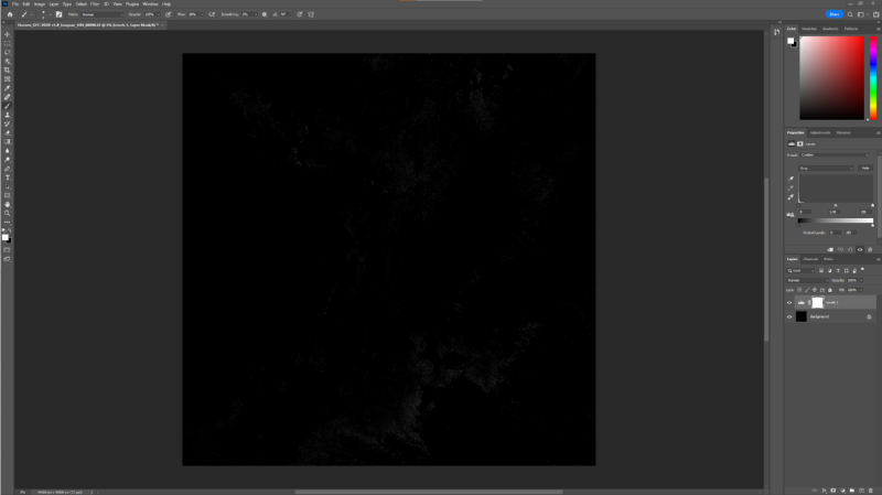
Not much to look at, because each pixel is an 8 bit value, so the numbers 0 to 20 are all pretty close to black as far as Photoshop is concerned. However, I can just use Photoshop’s Levels tool to stretch the values to cause 20 be white and 0 be black, and then we start to see that there is some data there:
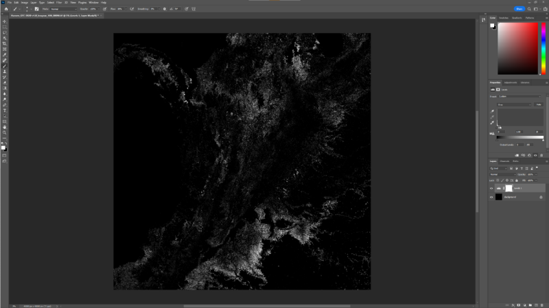
As an aside, I like that Photoshop thinks this image resolution is at 72 pixels per inch, whereas in fact by my quick and crude estimate it should be roughly 850 inches per pixel :)
Whilst Photoshop was a useful tool to quickly check our assumptions about the data, it's not how we're going to manipulate the data: for that we're going to lean back on the GDAL command line tools. The first thing I want to do is generate a new set of GeoTIFF files: one per year with the accumulative forest loss until that year. Whist I could write some code for that, one of the standard GDAL tools lets you provide some simple math expressions to transform the data, and given the simplicity of my query here, we can start with that.
For example, to say work out the forest loss up to 2012 for a given region, I'd use gdal_calc do:
$ gdal_calc.py -A Hansen_GFC-2020-v1.8_lossyear_50S_080W.tif --outfile 2012.tif --calc="255 * logical_and(A>0, A<=12)"
What this tool does is it lets you map one or more files to variables (I have one file here, which I've mapped to A) and then applies it to each pixel in turn. So if I wanted to use another file that say had a mask of where I wanted to include/exclude I could have added it with -B and then used B in my calc expression.
Anyway, lets check our working quickly with our good old friend Photoshop:
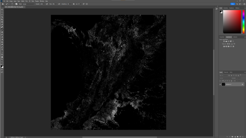
This time I didn't need to fiddle with the levels as the "255 *" part of my calc was turning every pixel to white effectively. If you compare this with the earlier screenshot you can perhaps convince yourself that the forest loss amount is less, which we’d expect this being the state some 8 years earlier than the final output shown before.
With a quick bash script I now have 20 such files to give me my layers, one per year in the survey. At this point you'll also start to realise the size of the data you're working with. The original GeoTIFFs were using lossless compression to keep filesizes down, but gdal_calc.py has no truck with such niceties. Thus my 40000x40000 pixel 8 bit images are 1.6 GB each, and I have 20 of them. If I was using some of the other Hansen files that have multiple channels of data you can end up with over 6 GBs per file at this stage, or a quarter terabyte for the set. And this is just for one 10 degree by 10 degree chunk of the earth: if I wanted to do say all of the Amazon, we're now getting into serious storage requirements.
I'm lucky, 4C has a server with lots of fast storage set up to make this sort of job doable, and I just do small runs on my own computer to let me test out my process first. Actually, another GDAL tool can help here, gdal_translate:
$ gdal_translate Hansen_GFC-2020-v1.8_lossyear_10N_090W.tif -scale 0 20 0 255 -outsize 50% 50% -of mbtiles test11.mbtiles
Early on I used the above command to both shrink the image sizes down to a quarter their original size (the outsize param) and used the scale param to change the value range of 0 to 20 for loss to 0 to 255, avoiding the Photoshop level trick, which does get tiresome quickly being a manual process. Anyway, just a reminder that the GDAL toolset has a lot of handy bits in it for common tasks, so before you write anything new it’s always worth checking if there’s a tool already for that job.
Now that I have my data, I want to get it onto a map on a web page to let people explore the data more readily.
I have a little familiarity with map visualisation, thanks to a small geo-startup I did back when mobile computing was just taking off (that was PlaceWhisper for those of you who’ve known me that long :). From that experience I knew that I wanted to turn my GeoTIFF data into a tile format.
The way pretty much all map visualisations work for the web and mobile, at least for with pixel data, is that they use two tricks to save you downloading an unimaginable amount of data just to look up the way to the nearest coffee shop: firstly they break the world up into a series of zoom levels, and within each zoom level they store a grid of 256x256 pixel images. So, at Zoom level 1, when you’re zoomed out to see the entire planet, you’d just have 4 tiles in a 2x2 grid. At zoom level 2 you’d want more detail, so you’d have a 4x4 grid (so 16 tiles) with a little more detail in each 256x256 image, and so on. By the time you get to level 20 where you can see house level detail you really have a lot of tiles to store!
So I want to take my high resolution GeoTIFF file, and convert it into a series of tiles, but also then shrink the image and repeat the process, until I get a usable set of zoom layers too.
The other thing that I need to consider at this point is what is the map projection being used. Because the earth is not a flat square, any 2D grid of pixels claiming to represent the earth’s surface must have a map projection associated with it to translate the rectangle or square grid onto an imperfect sphere. We can see from the output of gdalinfo above that the Hansen data is using a projection called WGS 84, where as web and mobile viewers use a different projection, called EPSG 3857 or more commonly the Web Mercator projection. We will need to convert between these two projections as we go, affectively stretching the image from one projection to another.
To cut a long story short, of course there's a GDAL tool to do what I want here. In fact, there's at least two I found, and I daresay there may be more. I used the following pair of commands, which gives me an mbtiles file, which is a package file that contains a set of tiles bundled into a single file I can move around, along with gdaladdo, which generates all the different zoom layers (gdal_translate just makes tiles for the unzoomed image as is):
$ gdal_translate 2012.tif --of mbtiles 2012.mbtiles
$ gdaladdo -r nearest 2012.mbtiles
The first command here takes my 40000x40000 pixel file and converts it to the mbtiles format without any scaling, so just generating a single zoom level of tiles. It also takes care of adjusting for the projection, which was a major relief, as I wasn’t looking forward to trying to work out the math for that myself!
Given the size of the hansen data the translate stage gives me tiles at a zoom level of 14, which is reasonably zoomed in to a country region scale, and useful for what I want to use it for. Unfortunately though, if I zoom out at all, most maps will stop showing my data, as the translated file just works at that one zoom level. So the second command there, the gdaladdo, will do a bunch of shrinking of my tiles to give me zoomed out layers. Without any arguments I find it gives me zoom levels 5 to 14 in the end, which is sufficient for my current use case.
An alternative tool I could have used is gdal2tiles, which creates a series of individual tile images in a directory structure. If I was shipping this demo as a product, that'd probably be a better route to go, as I could then put all these individual images on something like S3 and have a CDN like CloudFlare in front of them. But for little proof of concept projects like this, I perfer having the packaged mbtiles files I can move around given I tend to be regenerating the data frequently.
Update: As an aside, in the end, when I did want to move from mbtiles files to a static set of individual files I could put behind a CDN, rather than regenerate the files I just exploded the mbtiles files to pngs using this tool.
Whilst moving mbtiles files around makes it easier to manage things as I'm regenerating data a lot as I experiment, but no map software will show mbtiles files directly: they want to fetch images from a web server based on zoom level and an x and y offset. This means I need a server running somewhere that'll understand these files and respond to such requests. Thankfully, I found an off the shelf tool for that, mbtileserver. You can pass this a directory of mbtile files, and it'll serve each up at a different URL, which is perfect for me as I want to have 20 tile sets available to select from, one for each year.
Another bonus was that mbtileserver came already dockerized,so deploying it was quite easy too.
It's been a lot of steps along the way, so you'd be forgiven at this point if you'd forgotten our original aim: to have a webpage that lets me show the forest loss over time. The final step of this then is to find a javascript map tool. For this I went with MapLibre, an open source fork of the MapBox library. There are lots of libraries out there, but I went with this because I have some passing familiarlity with MapBox, as I used them back in my former startup days, but given I have my own tiles that I'm hosting myself, I didn't want to create a MapBox account for this project, just to use the viewer on my own data, so using the open version of that library made sense.
In addition to my own data, I realised that the maps looked better with some context on them, such as where the sea is, and country boundaries; note that the Hansen data I'm plotting just has tree loss, and no other geographic features that help give the data context. For these I found a vector data set that is open source that I could use here.
Combining the two with a little javascript magic I now have a webpage that does what I want:

As I drag the slider here I can slowly watch deforestation in Sierra Leone; it’s somewhat depressing, but the first step to dealing with a problem is to understand it, no matter how grim that may be. It’s also worth noting this data doesn’t cover any re-planting or other forest gain activities, so isn’t the whole picture, and you have to start to understand forest dynamics at this point. Another important thing to keep in mind with this kind of data: when it says forest loss is that just the first tree felled in a pixel region, the last tree felled? Whilst a picture is worth a thousand words, in this case words are still needed.
It was interesting playing with the mapping layer. The main takeway I got was that the vector data in the Positron GL Style data set is nicely broken up into different layers, and so I could insert my custom tiles between the land layer and the sea layer, and then have borders, rivers, etc. painted on top. If you look at the Photoshop images, although you can infer some of this, it makes a world of difference to understanding the data to have it all laid out for you.
You can find the little code I used to do this, and another test using deck.gl,over on github.
In the end, I also wrote my own little program to talk to the GDAL library directly for generating the tile sets, making it easier to process than having to run batches of commands by hand, and letting me optimise the workflow; you can also find that code over on github too.